
Beautiful Palettes, Beautiful Stories: Celebrating People of Color Through the 12 Seasons
By Megan Haynes ·
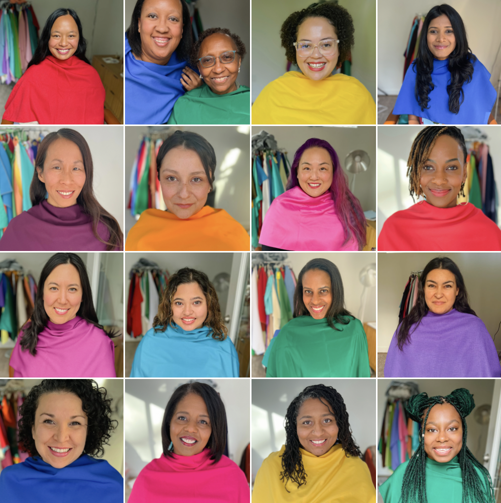
Over the past year, I embarked on a meaningful color analysis project celebrating People of Color with the 12 Seasons. The catalyst stemmed from a combination of factors: the noticeable lack of People of Color representation within the color analyst industry, a strong desire for my brand to be inclusive and showcase a diverse portfolio, and a personal curiosity to further my role as an industry innovator and leader in color analysis. Knowledge is power, and I hope this sparks fresh conversations and new ways of thinking.
All of the color sessions took place in my studio under full-spectrum lighting, encompassing the testing of over 100 drape colors. These sessions uncovered the photos, quotes, and lessons I'll share below. Huge gratitude to the incredible clients who lent their support.
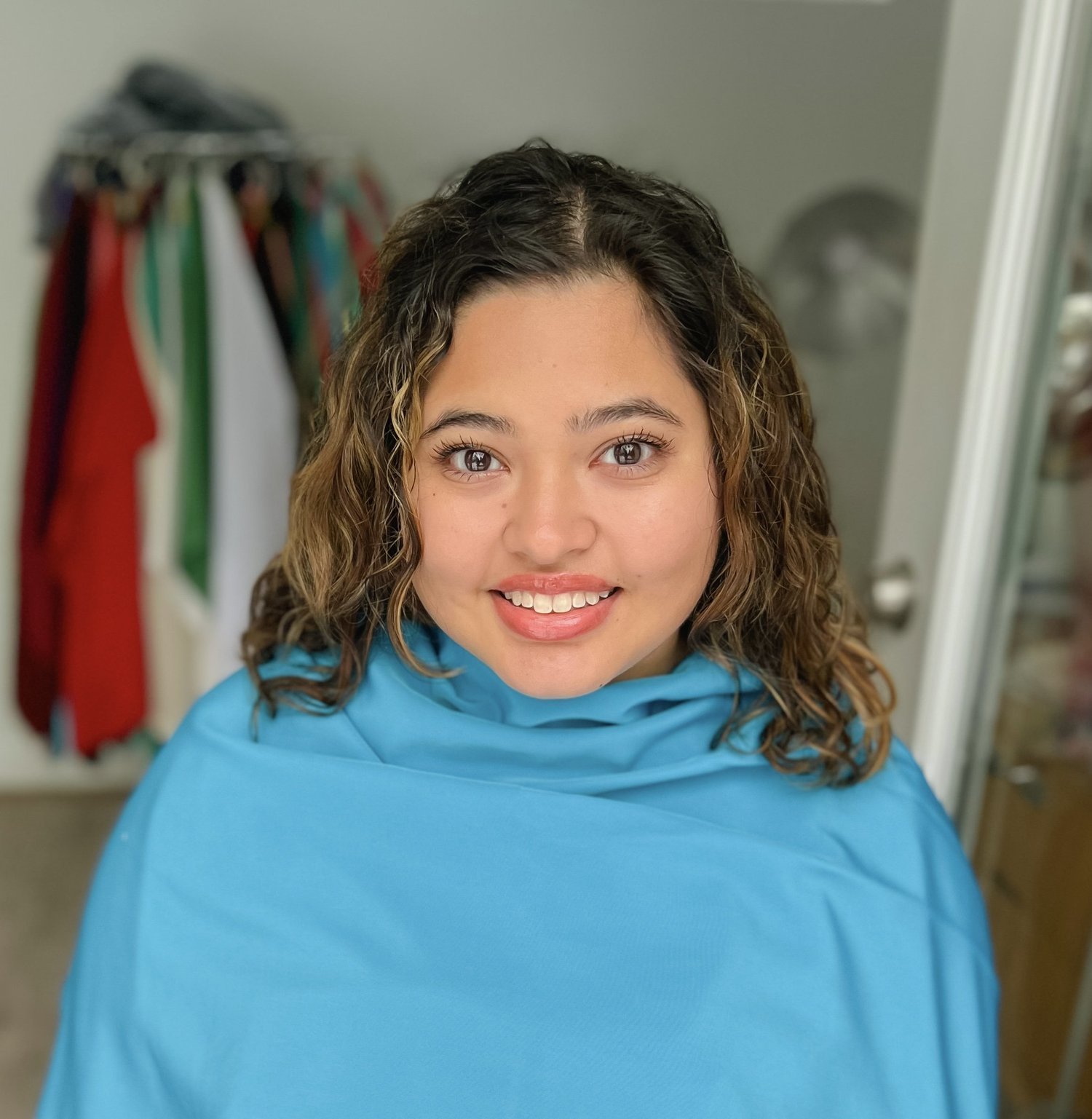
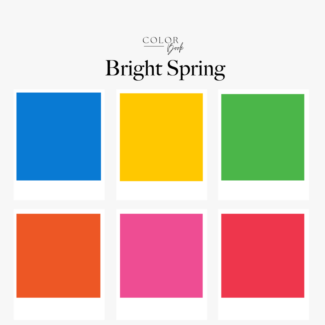
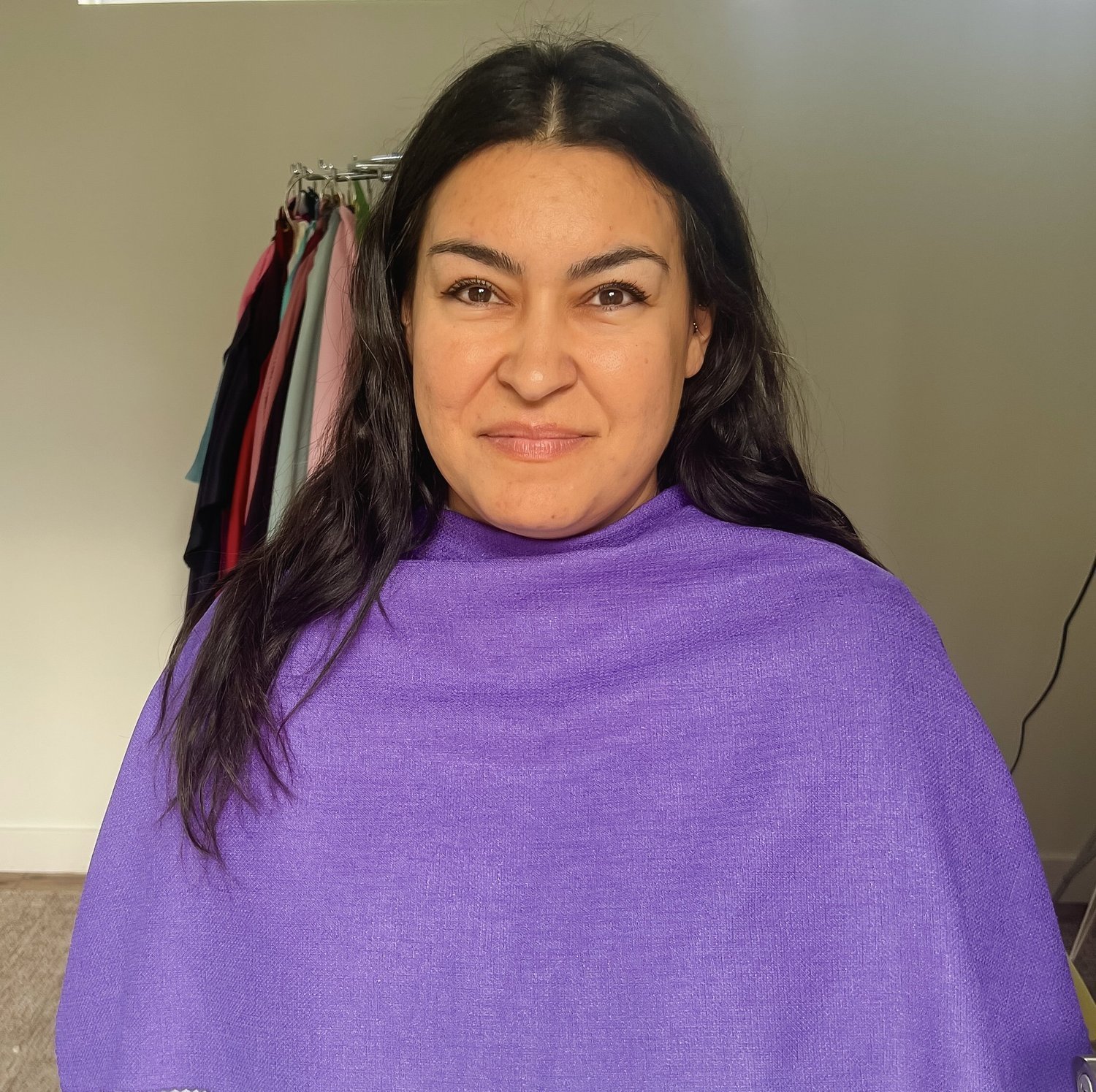
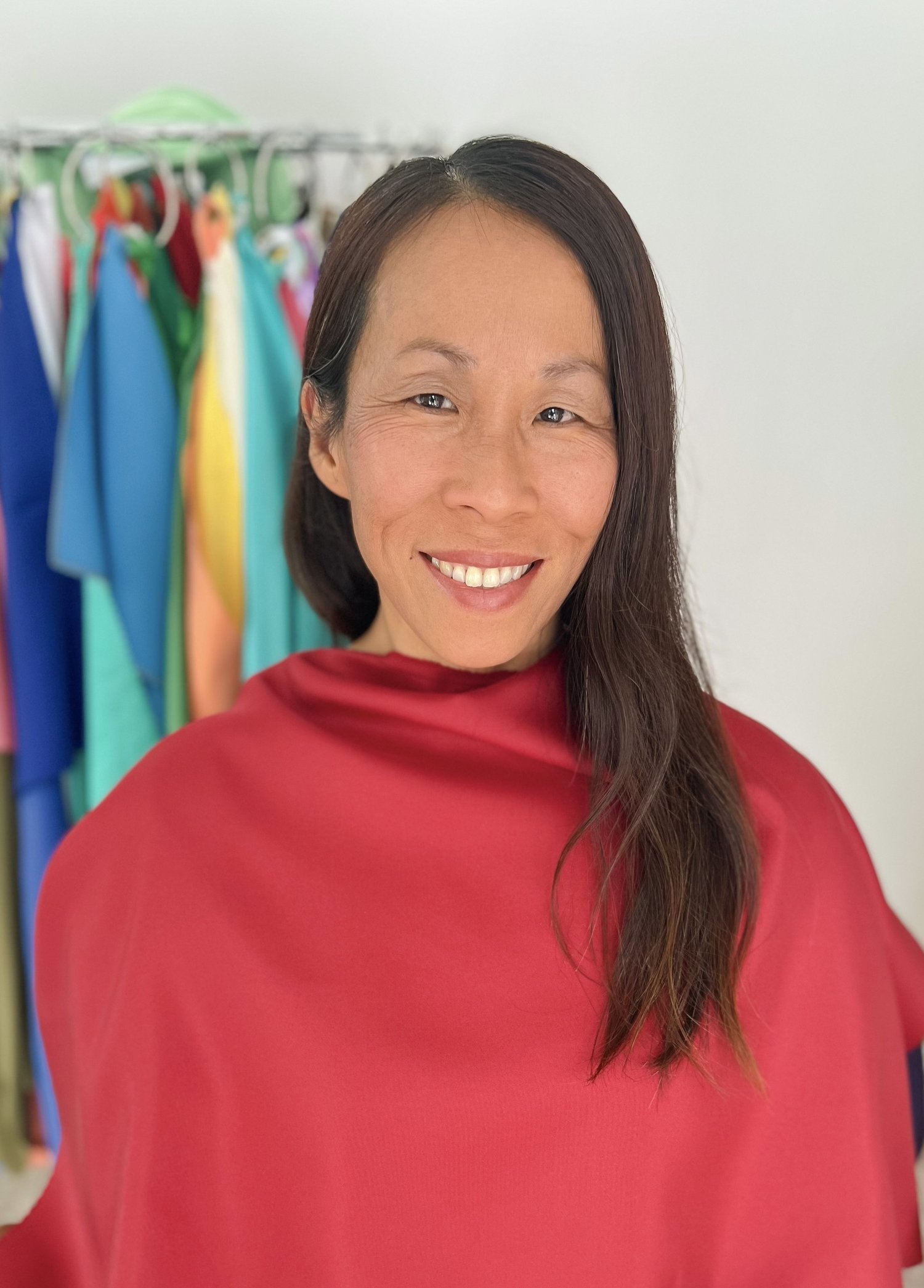
Bright Spring | Clear Spring


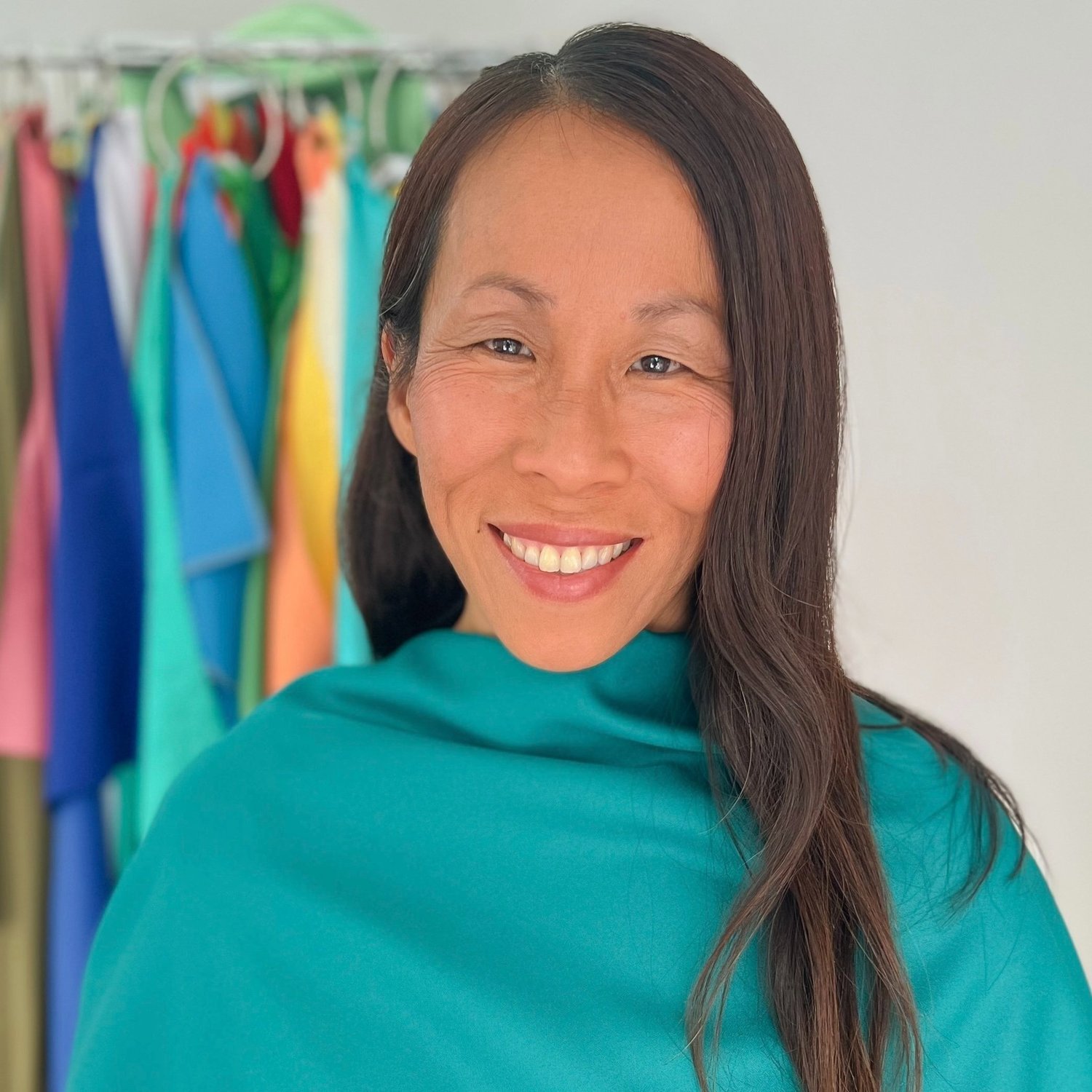
Bright Winter | Clear Winter

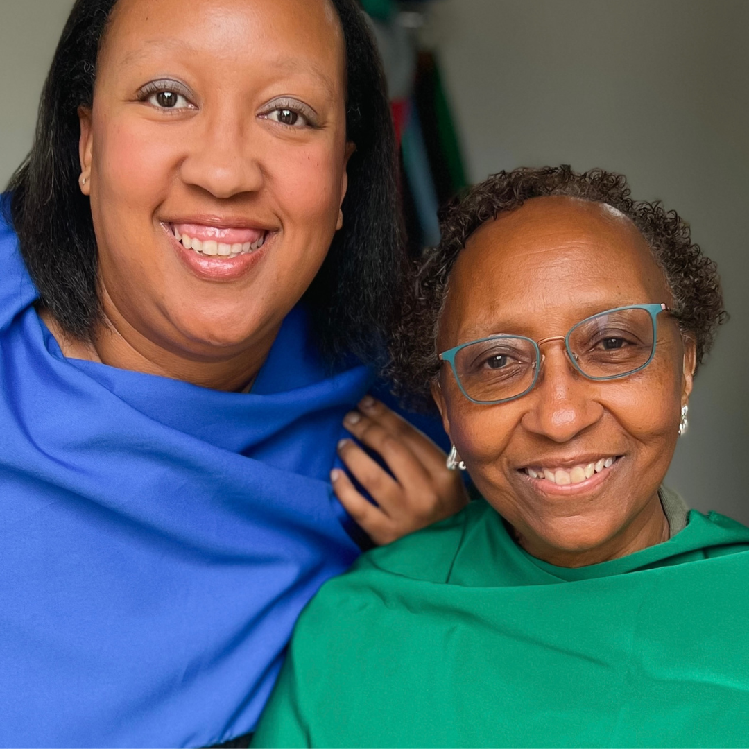
Cool Winter | True Winter
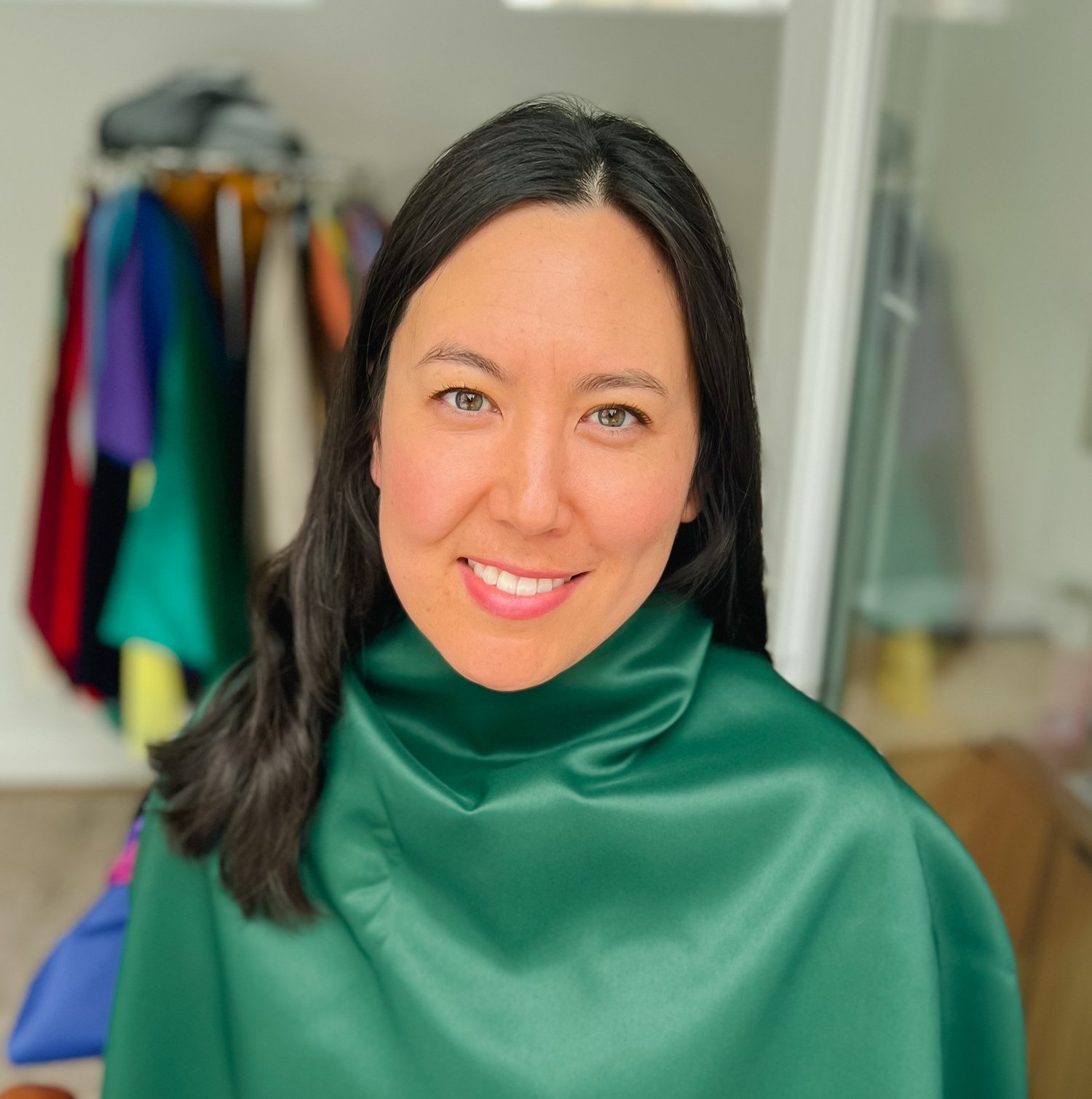
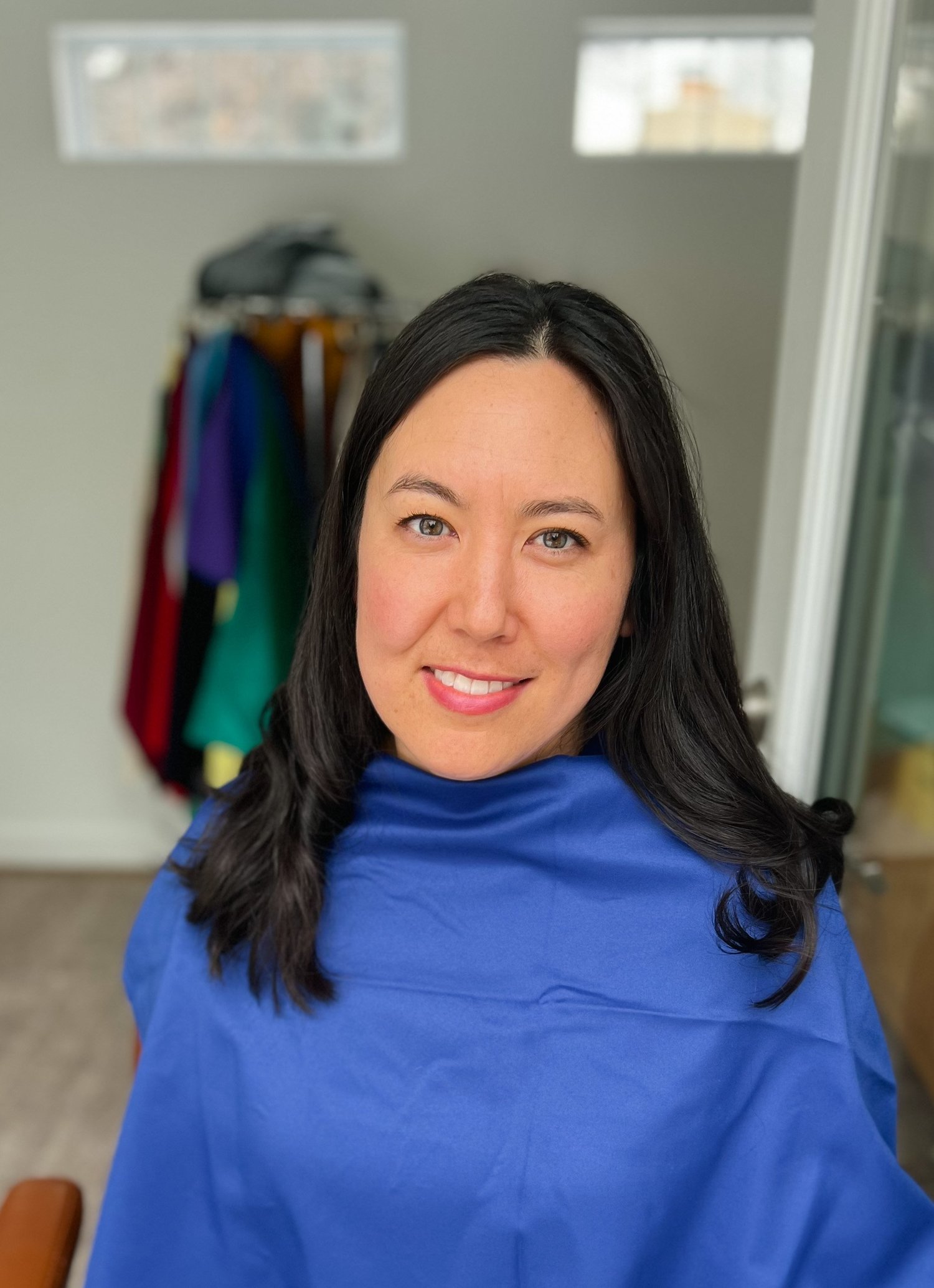
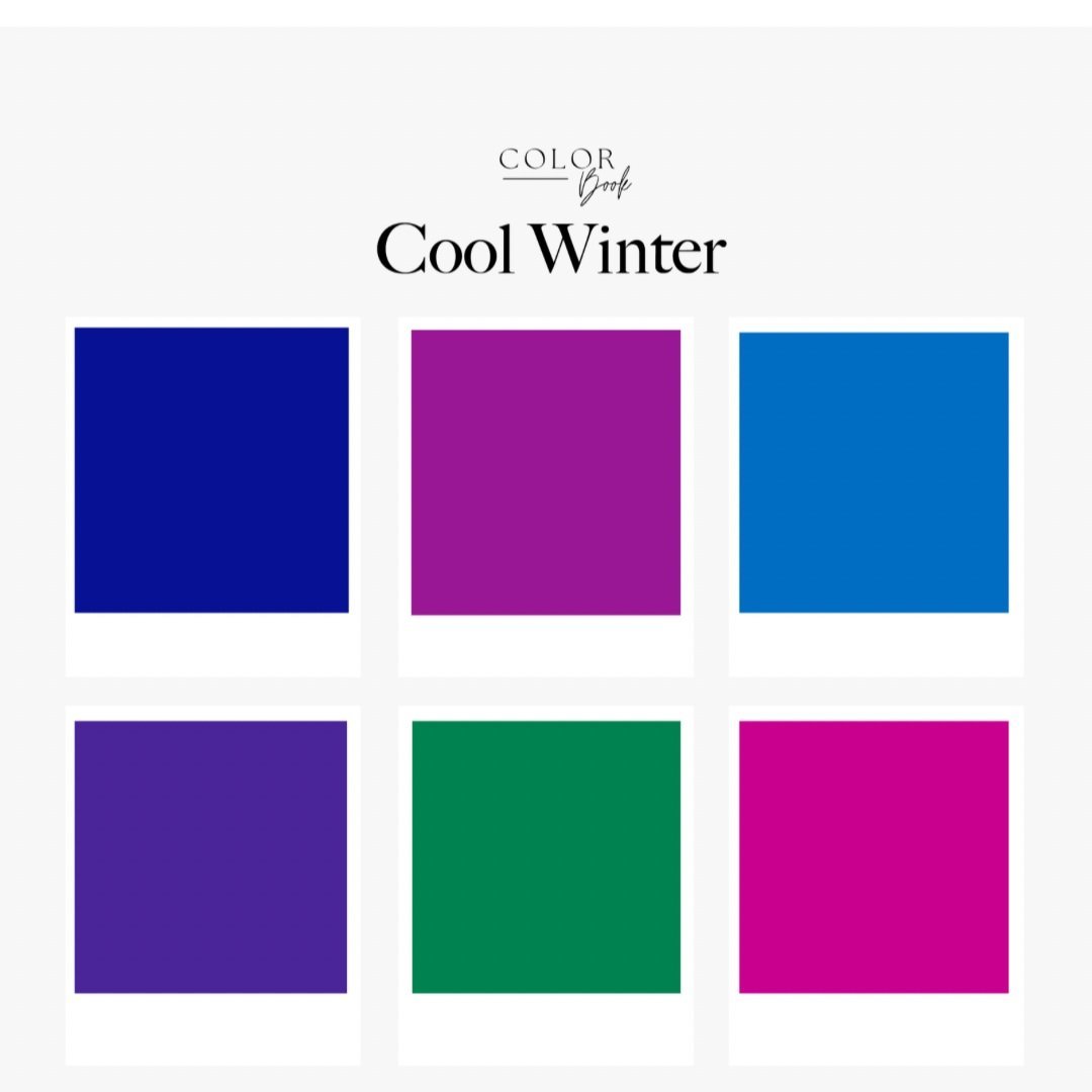
Dark Winter | Deep Winter
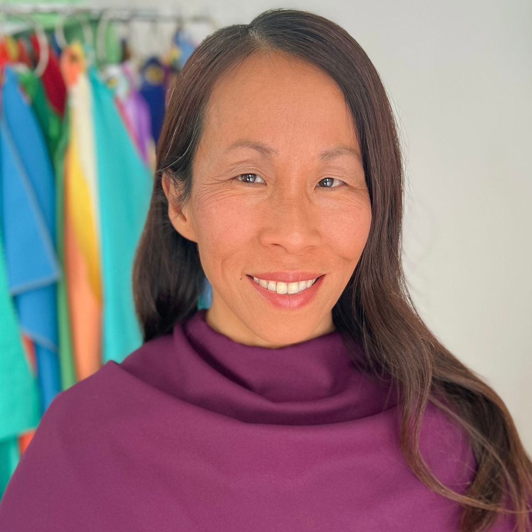
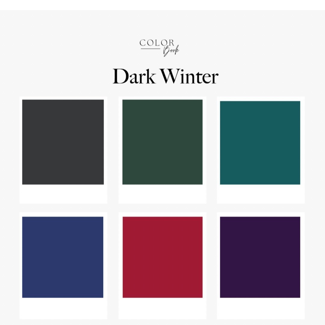
3 key lessons from this experience
As a color analyst dedicated to perfecting my craft, some of my most valuable lessons came from the mistakes I've made along the way. These errors have been my greatest teachers. Here are three key lessons.
Lesson 1: Overtone vs. undertone
The outer layer of your skin (the overtone) changes with seasons or sunlight. The undertone—the layer beneath—never changes. The undertone defines warmth, coolness, or more neutral undertones. It's common for People of Color to grab a "warm-toned" foundation only to find cool undertones beneath, and vice versa.
Appearances can deceive: someone might seem to have warm overtones (displaying more yellow), but the critical factor lies in how colors interact with their skin undertone.
Lesson 2: The drape dilemma
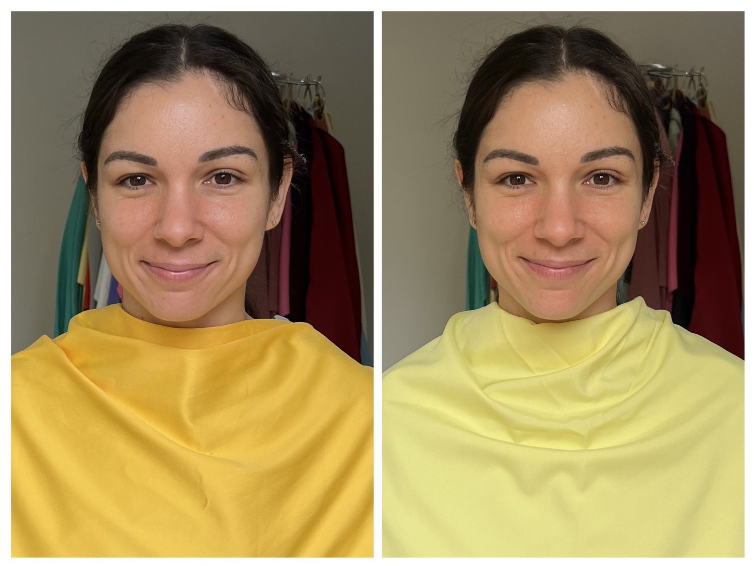
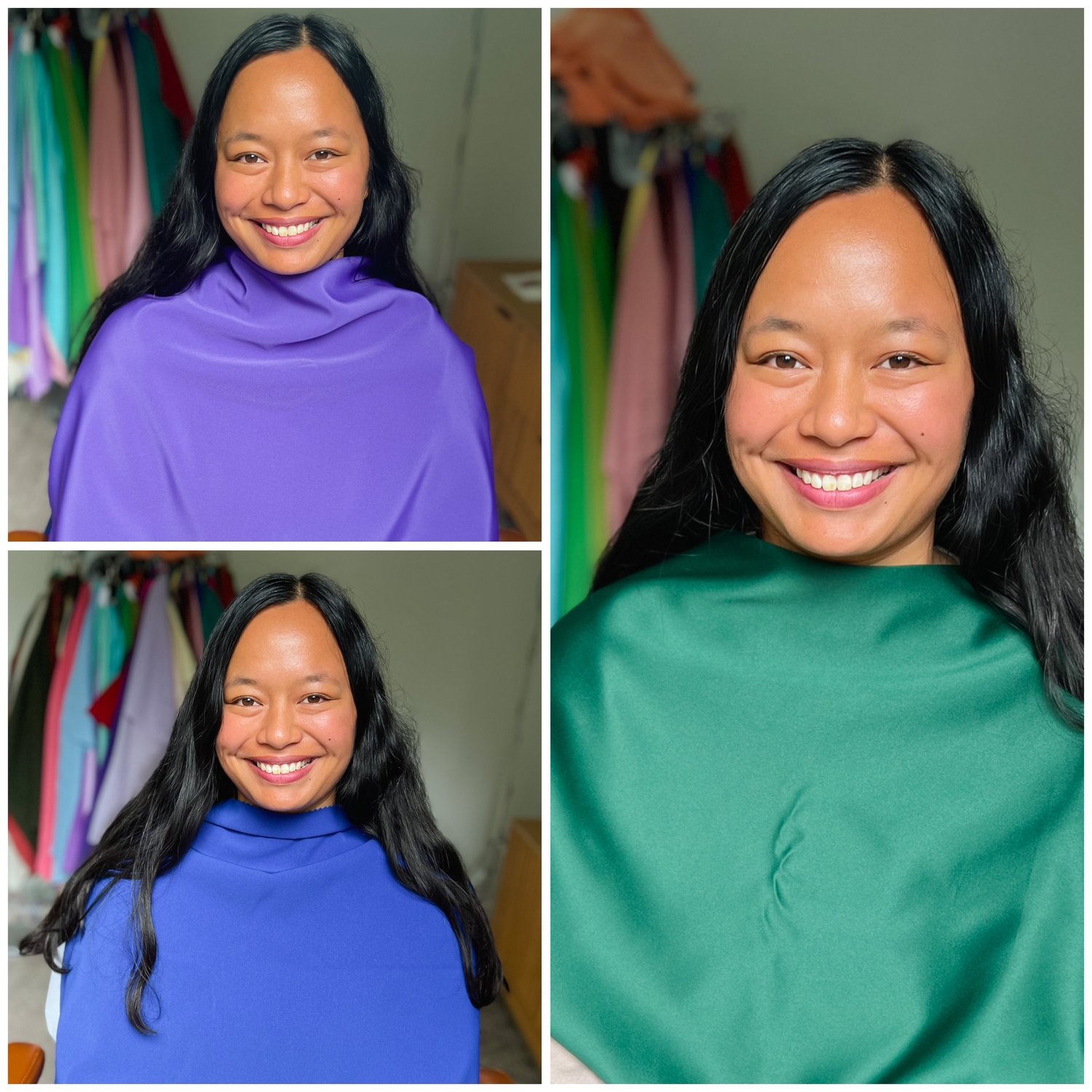
Bright Spring yellow vs. Bright Winter yellow: the Bright Spring yellow is blotchy and out of focus. The Bright Winter yellow puts her in focus and illuminates her skin.
Another key lesson: the critical role of having the right drapes to compare. A 12-season drape set will include drapes organized by the three dimensions of color—hue, value, and chroma. In this example I was going back and forth between Bright Winter and Bright Spring; my drape set includes high-chroma colors in both, and I'd already ruled out Warm Spring, Light Spring, Cool Winter, and Dark Winter. Multiple photos help unveil the complete color story when clients are close between seasons.
Lesson 3: The hair-and-eye deception
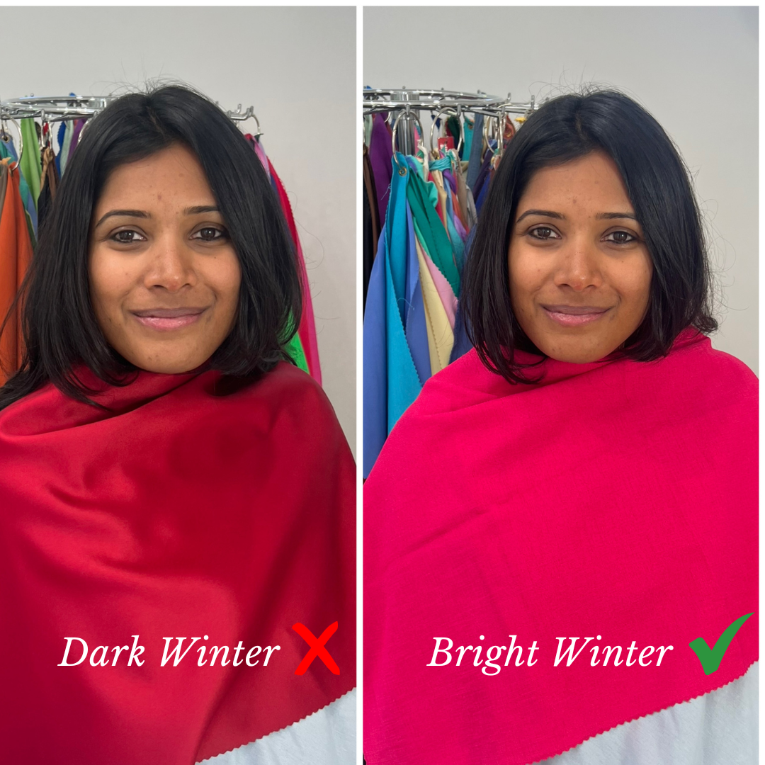
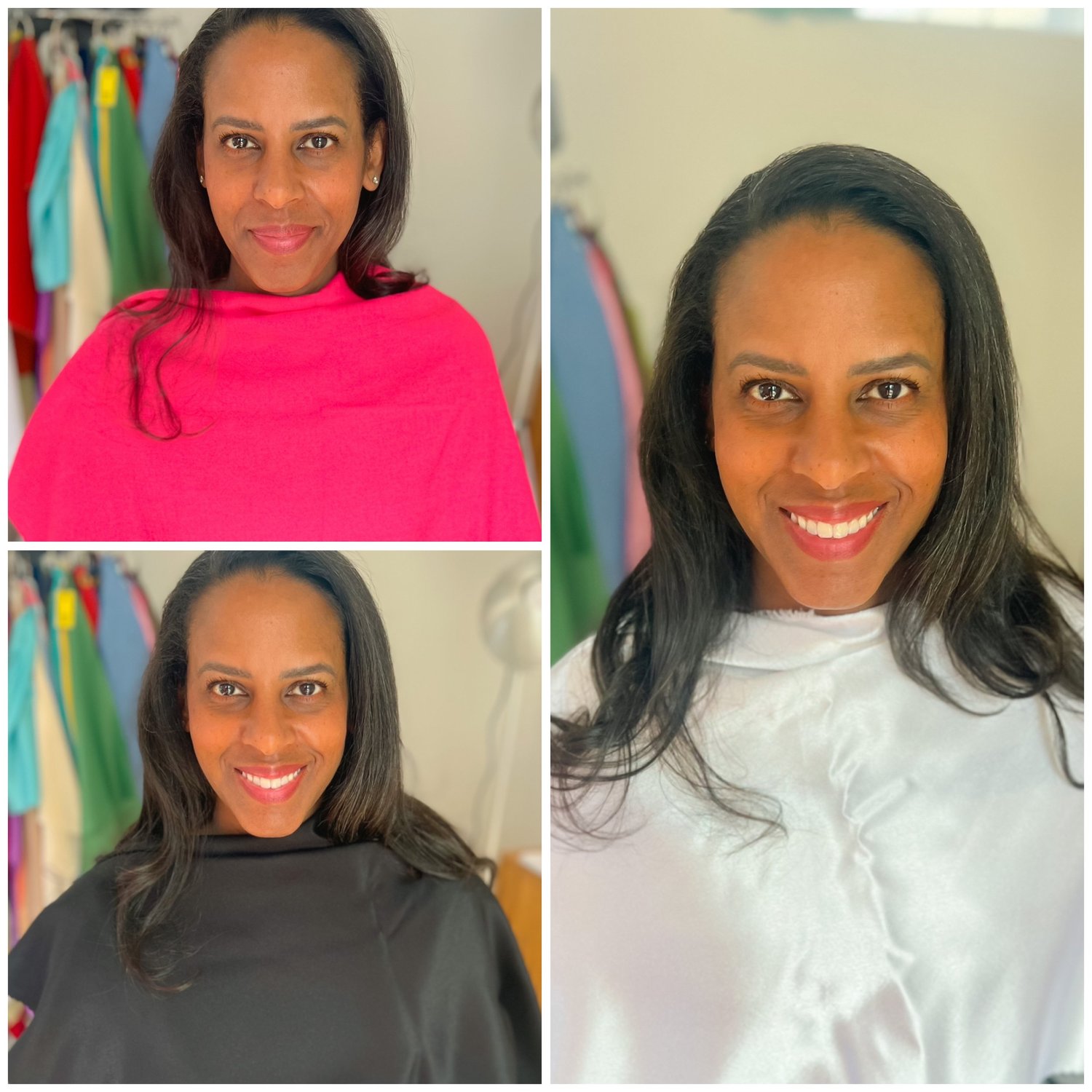
Bright Winter colors bring this client into focus—she looks healthy, energetic, and illuminated. Dark Winter is okay but doesn't sing.
At first glance, this client has darker hair and darker eyes. I first put her in Dark Winter, then realized I was making a mistake. We re-draped and found her true colors in Bright Winter.
The real magic happens when an individual's inherent brightness and contrast comes alive in the brighter colors. Even if someone has darker features, they may radiate in bright colors because they have brightness or contrast (between eyes/hair) in their coloring.
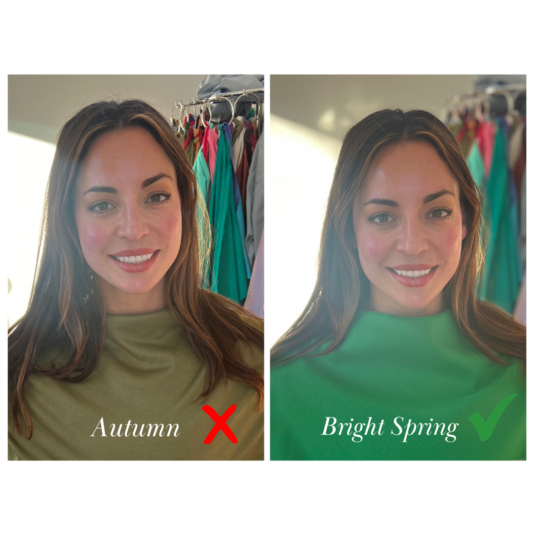
It's my opinion that many women of color often face the challenge of being misdiagnosed—being categorized as Dark Autumn when they truly shine in Bright Spring tones, or as Dark Winter when their true palette is Bright Winter.
Immense gratitude goes to everyone who supported this pursuit of knowledge, access, and innovation. Special thanks to my dear friend Haley whose local community connections opened doors to make this happen. While this marks a fantastic beginning, I'm eager to continue learning and emphasize more diversity in collaboration with the 12-season color palettes.

About the author: Megan Haynes
I'm a Colorado-based 12-season color analyst dedicated to helping you naturally look and feel your best. Trained by Kerry Jones of Indigo Tones, I'm driven to evolve and innovate in the field of color analysis for greater accessibility.